Bad usability impacts ROI, here's how to prevent that (and measure it)
Learn how bad usability impacts ROI with concrete data, plus metrics to measure and improve. Learn how UX, information architecture, and visual design (UI) impact user experience and product success.

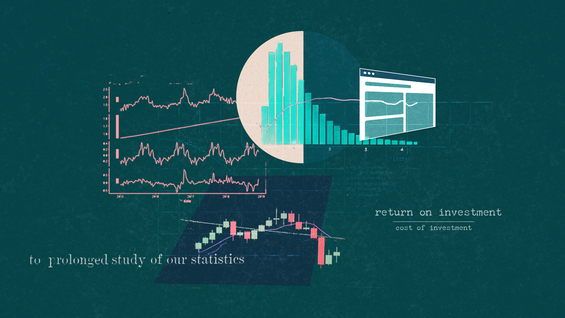
A 2023 study found that usability factors account for nearly 75% of user retention Adilawati et al., 2023). According to recent UX statistics compiled by UXCam (2025) and Tenet (2025), every dollar invested in UX yields a $100 return, representing a 9,900% ROI. I've seen this firsthand: designs I've launched have increased conversion by 8x simply by prioritizing usability. Yet most companies still treat it as an afterthought.
Usability measures the ease of use and effectiveness of the web or software product experience for your users to achieve their goals.
A few things can impact usability: design patterns, information architecture, flow, and visual design.
Design patterns: Using what users already know for better experience design
Design patterns are a repeatable design solution to common design problems. Think of them as best practices.
For example, how items are shown in an e-commerce experience. Most online stores display products in a grid layout with an image, title, price, and rating. Users expect to see this information in roughly the same places because this pattern has been refined over the years of use.
Design patterns reduce cognitive load because they rely on paradigms that are already familiar to users, so they don’t have to relearn a system. However, we have to understand the context of how someone will be using our product to make sure the design pattern is appropriate for the audience and use case. If you use the wrong UX design pattern, then you'll create more usability issues.
Understanding which design pattern best suits a user's task and goals is key to using patterns effectively in UX design and overall experience.
But the wrong pattern will create usability issues. The key is understanding which pattern best suits a user's task.
How to measure this key:
- A/B Testing: This is your primary tool. Don't guess if your new design pattern is better. Test it. Run an A/B test of the new pattern against the old one and measure the impact on conversion, time-on-task, or task success.
- Click Tracking: A heatmap will show you whether users are interacting with your new pattern as expected or if they are confused and clicking in the wrong places.
- Heuristic Evaluation: You (the expert) evaluate the pattern against the "Consistency & Standards" heuristic.
- SUS Survey: You can run this survey on both versions to see which one users feel is easier to use.
Your A/B test can show the conversion rate and how it impacts product metrics. The SUS survey explains why, using the usability metric. Design patterns and, by extension, design systems can and should be usability-tested prior to going live, or you risk metrics being affected.
IRL, most large companies, including Meta, usability test their design systems before launching them. Check out this article to see why not A/B testing could be a problem, and this article on a company that did A/B testing on design components.
Information architecture: Helping people find things
Information architecture (IA) is the structural blueprint of your website or app. It ensures that content is organized logically and is easy for users to find. A good Information architecture ensures proper organization of content to help establish a sense of findability. If we don't have a good information architecture, it becomes difficult for users to find things on our website, impacting our usability.
This encompasses content labeling, UI text, page structure, and organization.
• Content labeling: is the process of using clear and understandable names for the information on your site. For instance, using "Products" instead of a confusing label like "Solutions" on a navigation menu. The goal is to ensure users can easily identify what a piece of content is about.
• UI text: refers to all the words and phrases that appear on an interface to guide the user. This includes button labels ("Submit"), navigation links ("About Us"), and any other instructional text. These small elements can have a significant impact on how well people are guided to take action or on how well they are explained what they should do.
• Page structure: is about how elements are arranged on a web page or screen. It dictates the hierarchy of information, such as where the main heading, body text, and images are placed. A well-organized page structure, like the standard grid layout in e-commerce, helps users find information efficiently and reduces their cognitive load.
• Organization: is the overarching practice of arranging content into logical groups and categories. If your content is poorly organized, it becomes difficult for users to find things on your website, which directly impacts usability. Good organization, along with clear labeling, is what helps create a sense of findability for the user.
IA is a foundational step that should precede designing and laying out an experience. It helps you create a structured approach to organizing an app, ensuring you don't have to figure it out while planning. Please don't treat it as an afterthought, or your customers might be confused about how to navigate your website.
How to measure this key:
- Task Completion Rate: Can users find the "Products" page? Set up a simple usability test (even an unmoderated one) and measure the success rate. "95% of users found the page in under 10 seconds" is a complex metric that proves your IA works.
- Tree Testing: Before you even build a single screen, you can use tree testing to validate your content labels and hierarchy. This is how you use data to prevent bad design from the start.
- Card Sorting: Before going live with a navigation restructure, use card sorting to determine proper labeling, and use that as your initial step. Product metrics can identify patterns that emerge after people use the navigation in the wild.
Flow and interaction: Making the next step clear
Flow speaks to how people achieve their tasks and goals through a website, including which pages they see next. Part of thinking about flow includes how the system reacts to user action.
I like to think about flow in terms of what page a user should see next, where interaction is what action the system responds to. For example, the system reaction might be a toast message to confirm an action, or a hover state on a button when the user moves their mouse over it.
If the logical sequence of steps or what happens next doesn't match user expectations, this can harm usability. I recently had an experience on a government website, where I had to upload documents for a process. In the middle of the process, I was kicked out of the flow and told to come back to finish a step after an offline step of mailing in a document.
It was abrupt and awkward, leaving me confused about what was supposed to happen next. Poor flow design can significantly impact how people use and view your product experience. (I didn't finish the process of mailing in a document)
How to measure this key:
- Funnel Analysis: This is the core of measuring flow. Where are users dropping off in your checkout process? A funnel visualization (a key tool in visual analytics) will show you exactly which page your flow breaks. You will see "90% of users drop off on the payment screen." This is not a 'feeling', it's a data-driven diagnosis.
- Error Rate: My government example is a perfect metric. The "metric" for that bad flow is a 100% error rate or abandonment at that step. Track how many users get an unexpected error or fail to complete a flow.
- Usability test: Observe your users go through the entire flow to see if there's any learnings. Preferably, before the product is released, to mitigate the negative impact on business metrics.
Visual design: More than just pretty UI
In addition to information architecture and flow, visual design plays a significant role in ensuring usable products. Key visual design elements impacting usability include color, typography, iconography, and layout.
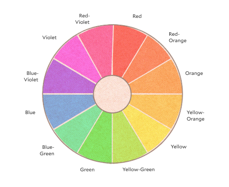
Color affects readability and can help or hurt accessibility. Typography determines how easily people can scan and read your content. Iconography can clarify actions or confuse users if icons aren't universally understood. Layout influences how efficiently users can navigate and complete their tasks.
The visual design of the experience not only impacts desirability but can also influence usability.
Visual hierarchy is the strategic arrangement of elements to guide the user's eye. Visual hierarchy is the deliberate layout of elements to direct the user's attention and highlight what matters most on the page. You can accomplish this by using a few key elements and communicating what is most important on the page. You can achieve this using a few core elements:
- Size: Larger elements naturally attract more attention. Use size to emphasize titles, headings, and main calls to action.
- Color and contrast: Use color to create contrast and make key elements stand out. A high contrast between text and the background improves readability and accessibility. For example, a bright, brand-colored button is more likely to be clicked than a gray one.
- Whitespace: Also known as negative space, whitespace is the empty area around elements. It reduces clutter, prevents the user from feeling overwhelmed, and helps them focus on the content. A page with proper spacing feels cleaner and more organized.
The choices you make about fonts directly affect how easily users can read and understand your content.
- Font choice: Select typefaces that are easy to read at different sizes. Serifs are typically used for long-form body text, while sans-serif fonts are standard for headlines and digital interfaces because they tend to look cleaner on screens.
- Font size and weight: Ensure the font is large enough for easy reading. Use different weights (bold, regular, light) to create a clear visual hierarchy between headings, subheadings, and body text.
- Line height and letter spacing: These elements can significantly impact readability. Correct line height prevents lines from merging, and proper letter spacing makes sure characters aren’t too close together.
Consistency in visual design is crucial for building user trust. When a user navigates from one page to another and sees a consistent layout, color scheme, and set of icons, they feel a sense of familiarity and control. It reinforces the brand identity and makes the product feel reliable and professional.
How to measure this key:
- Heatmaps: You think your bright call-to-action button is the center of attention. A heatmap proves it by showing you what users are actually clicking on.
- Accessibility & Contrast Ratios: This isn't a "nice-to-have ", it's a metric. Use accessibility tools to measure your color contrast ratios. A "Fail" grade is data-driven proof that your visual design is unusable for a portion of your audience.
- 5-Second Tests: Show a user your design for just 5 seconds and ask what they remember. This is a simple way to get quantitative data on whether your visual hierarchy is working. This is a simple and effective technique.
- A/B tests: Testing isolated visual elements can work for this scenario, but be careful to make sure you've isolated the element to make the correct conclusion. Here's some examples of how design elements can be tested.
- Concept tests: I'm a fan of running informal concept tests before release to gather early feedback. You will determine whether the visual design contributes to the product's overall usability and identify the issues.
Accessibility: Usability for everyone
Accessibility isn't a nice-to-have. It's fundamental to usability. When you design for accessibility, you improve the experience for all users, not just those with disabilities. The 'curb-cut effect' demonstrates this: wheelchair ramps help parents with strollers, delivery workers, and anyone pulling luggage.
Key accessibility elements that impact usability:
Color and contrast: Beyond the WCAG 2.1 AA standard (4.5:1 contrast ratio for normal text), high contrast improves readability for everyone, especially on mobile devices in bright sunlight. Tools like WebAIM's contrast checker can validate your choices before launch.
Keyboard navigation: Every interactive element should be reachable via keyboard. This helps power users who prefer keyboard shortcuts, not just those who can't use a mouse. Visible focus indicators show where users are on the page.
Clear language: Plain language benefits users with cognitive differences, non-native speakers, and anyone scanning content quickly. The UK government's design system requires content to be readable at a 9-year-old reading level—making it more usable for everyone.
Flexible interfaces: Allowing users to zoom to 200% without horizontal scrolling, resize text, or adjust spacing helps those with visual impairments and anyone reading on different devices.
How to measure accessibility:
- Automated testing: Tools like axe DevTools catch ~30% of issues
- Manual testing: Navigate your site using only a keyboard
- Screen reader testing: NVDA (free) or JAWS can reveal significant barriers
- User testing: Include users with disabilities in your research. They often reveal usability issues that benefit everyone.
Your data-driven toolkit
Using a combination of product metrics like conversion, feature adoption, and churn can reveal what is happening with your product. When determining whether a design is usable, it's wise to apply some of these methods before releasing the product to identify issues early. Otherwise, you might face negative business impacts. Both traditional usability methods and product analytics work together to give you a complete view of the product before, during, and after launch.
Product analytics (The What)
These tools will show you what is going wrong or right with your product. Think of this as the symptom. You won't get to the specific problem unless you examine the details of usability. Dig into the specifics of usability.
Usability tools (The Why)
Tools such as usability tests, SUS surveys, tree testing, and heuristics will help you identify the cause of the symptom. Some of these usability tools are a good way to mitigate poor experience-related problems in business metrics.
Using heuristic evaluations to determine the usability of a product
Heuristic evaluations involve experts reviewing your product against established usability principles. The concept of guidelines for evaluating the usability of a user interface was introduced in a landmark article, "Heuristic Evaluation of User Interfaces" by Jakob Nielsen and Rolf Molich.
These heuristics are still used today. They consist of 10 Heuristics established and refined in Jacob Nielsen's follow-up article, "Enhancing the Explanatory Power of Usability Heuristics." The idea behind the heuristic evaluation is that a professional well-versed in usability methods can evaluate the design using the 10 guidelines and assign a usability score to the product experience.
The heuristic evaluation method is considered a low-effort approach to usability with significant impact. Proper usability testing can be costly, and while necessary for experiences like flight simulation or medical devices, it might not be required for consumer or Saas type products. (See the AI prompt below)
Using surveys to evaluate usability
Surveys let you gather direct feedback from users about their experience. The System Usability Scale (SUS) is one of the most widely used survey methods. It's a simple 10-question survey that gives you a score from 0 to 100, making it easy to benchmark your product's usability over time or against competitors, providing valuable metrics for evaluation.
The Usability Metric for User Experience (UMUX) survey is also used to measure usability. It's a short 4-question survey used instead of the SUS. It was developed for scenarios where the SUS couldn't cover the diverse range of use cases for measuring experience. Additionally, it faced challenges with international audiences due to a lack of proper translations for specific words in the SUS survey. The UMUX measures the system's effectiveness, satisfaction, overall efficiency, and overall effectiveness.
Surveys offer a straightforward way of measuring experience.
Using metrics and task evaluation to measure usability
Other measurement methods for usability evaluation include task completion rates, time on task, and error rates. These metrics tell you how successfully and efficiently users can complete their goals. You can also use click tracking and heat maps to see where users are clicking and how they navigate through your product.
Formal usability tests involve watching real users try to complete tasks with your product, often revealing issues you never would have anticipated.
There are different approaches to usability testing depending on your goals and timeline. Traditional usability testing involves running sessions with multiple users, then analyzing all the data before making changes.
But there's also RITE testing, which stands for Rapid Iterative Testing and Evaluation. With RITE testing, you make fixes immediately after identifying problems, then test the updated version with the next participant. This approach lets you solve issues faster and validate your fixes right away.
The key is to test early and often. Don't wait until your product is finished to find out if people can use it.
Putting it all together
For now, it's essential to understand the various factors that can influence the usability of your product and most importantly how to measure them. The what and the why are necessary for exceptional product exper
Remember these four things when designing your experience, and you'll be on your way to creating a usable design. These elements work together. Great design patterns won't save a confusing flow, and beautiful visuals can't fix poor information architecture.
The goal is to create experiences where users can accomplish their goals efficiently and without frustration. When you get all four elements working in harmony, you'll have a product that people actually want to use.
Download The Product Intelligence Workbook
Turn your metrics into recommendations that land. 10 frameworks that turn user behavior into business language.
References
Adilawati, L., Aini, Q., & Nuryasin. (2023). Usability analysis of MSME business accounting applications based on user retention using ISO 9241-11. INTENSIF: Jurnal Ilmiah Penelitian dan Penerapan Teknologi Sistem Informasi, 7(1), 106-120. https://doi.org/10.29407/intensif.v7i1.18879
Brooke, J. (1996). SUS: A "Quick and Dirty" Usability Scale. In P. W. Jordan, B. Thomas, B. A. Weerdmeester, & A. L. McClelland (Eds.), Usability Evaluation in Industry (pp. 189-194). London: Taylor & Francis
Dodier-Lazaro, S. (2024, June 25). How we A/B test our design system components. Medium. https://medium.com/@stevedodierlazaro/how-we-a-b-test-our-design-system-components-af7a75ed4cae
Finstad, K. (2010). The Usability Metric for User Experience. Interacting with Computers, 22(5), 323-327. https://doi.org/10.1016/j.intcom.2010.04.004
Nielsen, J., & Molich, R. (1990). Heuristic evaluation of user interfaces. In Proceedings of the SIGCHI Conference on Human Factors in Computing Systems (CHI '90), 249-256.
Nielsen, J. (1994). Enhancing the explanatory power of usability heuristics. In Proceedings of the SIGCHI Conference on Human Factors in Computing Systems (CHI '94), 152-158.
UXCam. (2025, March 31). 50+ UX statistics to convince stakeholders 2025. UXCam Blog. https://uxcam.com/blog/ux-statistics/